i still need to order some (and let you know about a slight correction on one of the stickers), but unfortunately school is crazy at the moment, so i don't know when i have the time to submit my order. will you start a second sheet once the first one is full?
sure, why not


I have asked Pieter to pickup again 4 pieces at the supplier...
so if the second sheet is not full, i just collect there again untill its full again..
Anyway,
I did a little experimenting with embossing the "Clarendon bold" font.
Not a succes, since illustrator converts it to raster and applies the embossing effect then..
that looked horible since it is so small
IMHO too many jaggered edges, and it will totally ruin the nice sticker.
So i went the other direction, it is not possible to get the exact effect as imprinted letters ofcourse,
but a little gray tint put in top of a grey field that represents the color of the aluminium gave me satisfying results..
Now i have done some different fonts, since the "clarendon" looked too thick
I searched for a simular font:
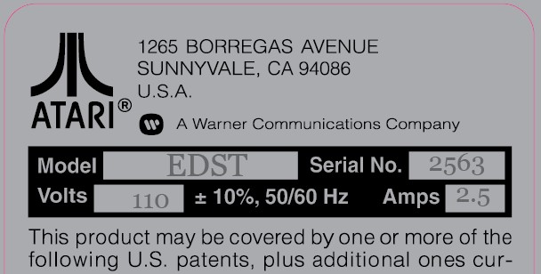
Another candidate, this time a little more classic.
then just plain "courier" since they use that also many time in real typewriters (well at least in europe the did)
but all in all it did not "catched me"

Then i found this, it looked way more authentic to me..
and at last the one that attracts me the most, since it does have a more authentic effect than the somewhat "destroyed/old" effect that the previous had.
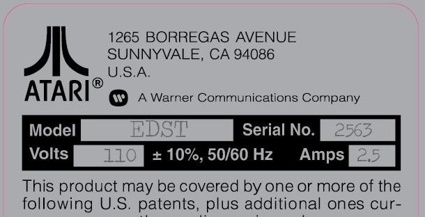
If you ask me, then i use the last.
but maybe you have another prefference..
What you guys think ?


