Author Topic: True Type advice needed  (Read 77806 times)

Etienne MacGyver

  • ArcadeLifeStyler'
  • ***
  • Posts: 7611
  • The Netherlands
    • View Profile
True Type advice needed
« on: November 22, 2010, 04:08:17 PM »
As you all know i am busy with the restauration of my Crazy kong.
in order to reproduce the CPO i need some advice from the pro's here  ;)
I did a little search and i came close, but i feel its not the correct one..
Anybody an idea what font to use for the instructioncard ?
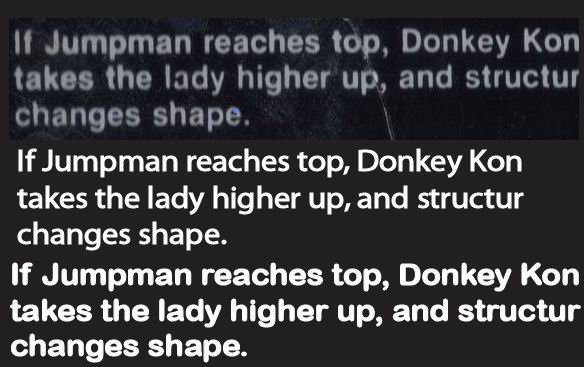


the first is plain Arial, the second is Arial rounded MT bold

It feels like i need arial rounded without the bold...

Superully

  • ArcadeLifeStyler'
  • ***
  • Posts: 6300
  • Southern Part of Germany
    • View Profile
Re: True Type advice needed
« Reply #1 on: November 22, 2010, 04:47:56 PM »
have you tried WhatTheFont?
all i need is ... PONG - and a select few others: TOUCH ME, DRAGON'S LAIR, JOUST, ROBOTRON, MR DO, SAN FRANCISCO RUSH THE ROCK!!!

liquidx

  • Member
  • **
  • Posts: 431
  • Bruxhell, Belgium
    • View Profile
Re: True Type advice needed
« Reply #2 on: November 22, 2010, 06:37:29 PM »
As you all know i am busy with the restauration of my Crazy kong.
in order to reproduce the CPO i need some advice from the pro's here  ;)
I did a little search and i came close, but i feel its not the correct one..
Anybody an idea what font to use for the instructioncard ?

the first is plain Arial, the second is Arial rounded MT bold

It feels like i need arial rounded without the bold...

Looks like helvetica bold to me, just with softness and artifacts from the print process.

Arial only really came into common usage years later when Microsoft included it in Windows so there's practically no chance anything from that period uses it.


findapinball.com - The European pinball locator

Q*ris

  • ArcadeLifeStyler'
  • ***
  • Posts: 2501
  • CAP'TAIIIN ARCADE!
    • View Profile
Re: True Type advice needed
« Reply #3 on: November 22, 2010, 11:48:52 PM »
Yes liquidx is right it's just some kind of helvetica with wider spacing between the letters:
« Last Edit: August 11, 2014, 01:42:40 AM by chrischris »

Etienne MacGyver

  • ArcadeLifeStyler'
  • ***
  • Posts: 7611
  • The Netherlands
    • View Profile
Re: True Type advice needed
« Reply #4 on: November 23, 2010, 01:59:07 PM »
Big thanx to liquidx & ChrisChris !  :spaceace:

i received your file chris, placed the text on top of the pic, and ajusted the width a little..

Perfect match


Thanx alot guys !

Q*ris

  • ArcadeLifeStyler'
  • ***
  • Posts: 2501
  • CAP'TAIIIN ARCADE!
    • View Profile
Re: True Type advice needed
« Reply #5 on: November 24, 2010, 08:01:55 AM »
Glad I could help!
What wouldn't I do to "take the lady higher up"  ;)

McVenco

  • Member
  • **
  • Posts: 151
    • View Profile
    • www.amigascene.nl
Re: True Type advice needed
« Reply #6 on: November 24, 2010, 12:10:37 PM »
Yes liquidx is right it's just some kind of helvetica with wider spacing between the letters:


If you want to be REALLY precise then you still have to look for another font, helvetica is not it.

For instance: look at the small letters a and g. In the Helvetica font, the a has a little arc on the bottom right, and the arc at the bottom of the g is wider in Helvetica than in the original. Also, the capital K is slightly different.

But if you're not too critical, I'd say Helvetica comes very close  ;)
No arcade cab(s) yet, but happy owner of 2 Colecovisions, 2 Amigas and a pc running Mame.

Etienne MacGyver

  • ArcadeLifeStyler'
  • ***
  • Posts: 7611
  • The Netherlands
    • View Profile
Re: True Type advice needed
« Reply #7 on: November 24, 2010, 12:40:24 PM »
I like to be really precisely, and i am open for suggestions too  ;)
So wich font is it you think ?

Helvetica is really comming close

McVenco

  • Member
  • **
  • Posts: 151
    • View Profile
    • www.amigascene.nl
Re: True Type advice needed
« Reply #8 on: November 24, 2010, 01:52:01 PM »
I'm no font expert, so I'm not sure where to look to get an exact match. Helvetica comes close indeed, but the original letters are a little bolder, and have less sharp edges. If I've got some spare time left tonight, I'll try if I can find something...
No arcade cab(s) yet, but happy owner of 2 Colecovisions, 2 Amigas and a pc running Mame.

liquidx

  • Member
  • **
  • Posts: 431
  • Bruxhell, Belgium
    • View Profile
Re: True Type advice needed
« Reply #9 on: November 24, 2010, 02:20:18 PM »

If you want to be REALLY precise then you still have to look for another font, helvetica is not it.

For instance: look at the small letters a and g. In the Helvetica font, the a has a little arc on the bottom right, and the arc at the bottom of the g is wider in Helvetica than in the original. Also, the capital K is slightly different.

But if you're not too critical, I'd say Helvetica comes very close  ;)


I'm pretty sure it's Helvetica Bold or a very close relative, the bold version has smaller spurs because of the weight. Also remember this was printed back in the days of phototypesetting where multiple films were often combined and hand corrected in camera to get the final result. Add the screen-printing process to that and you often get artifacts/distorsion of that type. (Yes, I'm that old. I worked in design before desktop publishing, I have the marks to prove it :) )

There are also multiple versions of helvetica. Depending on who edited that particular one, there could be differences.
You can also try its ancestors/relatives like Akzidenz-Grotesk and Univers. From memory, Univers 55 was often available on phototypesetters but I think it has a straight a.


findapinball.com - The European pinball locator

Etienne MacGyver

  • ArcadeLifeStyler'
  • ***
  • Posts: 7611
  • The Netherlands
    • View Profile
Re: True Type advice needed
« Reply #10 on: November 24, 2010, 02:24:08 PM »
I'll take helvetica  ;)

thats close enough for me  8)

Vnera

  • Member
  • **
  • Posts: 316
    • View Profile
Re: True Type advice needed
« Reply #11 on: November 24, 2010, 08:44:17 PM »
If you want i can email my sister. She is learning for becoming a graphical designer and she knows allot about letter fronts.

Etienne MacGyver

  • ArcadeLifeStyler'
  • ***
  • Posts: 7611
  • The Netherlands
    • View Profile
Re: True Type advice needed
« Reply #12 on: November 24, 2010, 09:06:38 PM »
Like i said, im open for suggestions

Q*ris

  • ArcadeLifeStyler'
  • ***
  • Posts: 2501
  • CAP'TAIIIN ARCADE!
    • View Profile
Re: True Type advice needed
« Reply #13 on: November 25, 2010, 07:56:13 AM »
Anyway we know it's Helvetica (or related), that's already something.
Like liquidx said it's a very large family with a lot of different "editions".
Might be tricky and time consuming to find the perfect one but that's not impossible.
Also in this case, I'm 100% sure the end of the letters are not rounded, it's just a distortion caused by a bad scanning.
Same for the super bold effect.
« Last Edit: November 25, 2010, 07:59:11 AM by chrischris »

Blanka

  • ArcadeLifeStyler'
  • ***
  • Posts: 729
    • View Profile
Re: True Type advice needed
« Reply #14 on: November 25, 2010, 10:41:01 PM »
I think it is Helvetica Neue 75 Bold or 85 Heavy.