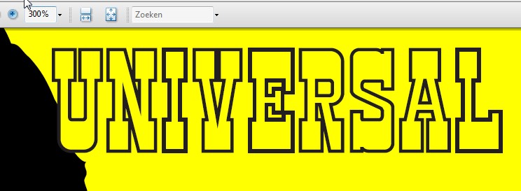
Just opened the file in Acrobat reader, and your right, it looks strange, so i did some testing:
300% looks strange, like some letters are a bit faded and the others are sharp.

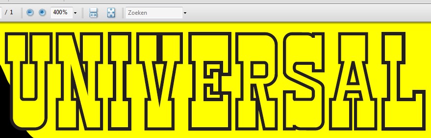
400% looks almost fine, just a slight view of the issue appears, when i zoom deeper, it dissapears..
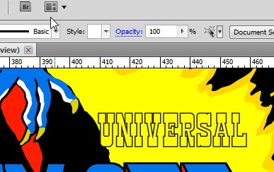
then i went to Illustrator...
300% looks fine
400% looks fine too, and so do all other zoomfactors there, so i guess its the way acrobat reader shows it to you.
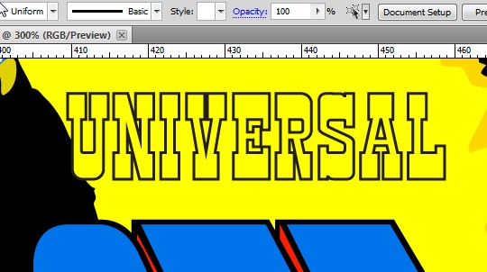
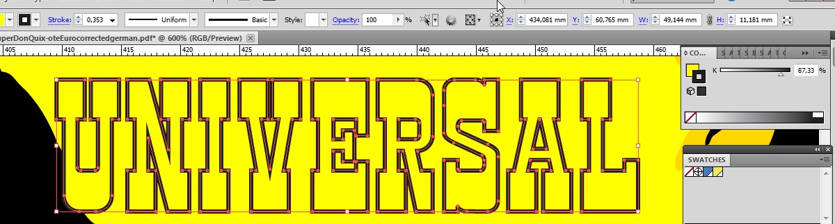
To be absolutely sure, i zoomed in and checked the thickness and the border color..
as you can see all the lines are a fraction thicker than the anchorpoints so they are really the same..
all are 87,33% black..
I think the file is ok, its just the way acrobat handles the image..
there is however another possible explanation, but thats something the AI experts here maybe can confirm, i have moved some of the letters to position them on top of the original, and maybe these are the letters that i have moved, or the opposite, did not touch..
i would say that does not matter since they are all paths, and also i dont know exactly if these are the ones that i have shifted..
just a thought..


