i dont know what it means, but Andre's suggestion sounds very plausible

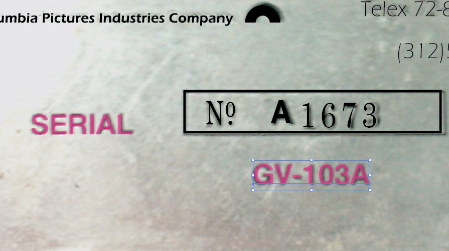
it looks indeed bold, and it is, its just the effect of one bigger pic compared to a resized one.
when you "blow up" bold letters, they look thinner:
The color is not yet converted to black, i grabbed the vector logo from zorg

(i'll print both the black and the color, so you can choose when you see them which you use)
Hope that clears things up ..
i will change your number Bruno


